Juggle
Design System
Methodology
Needs must
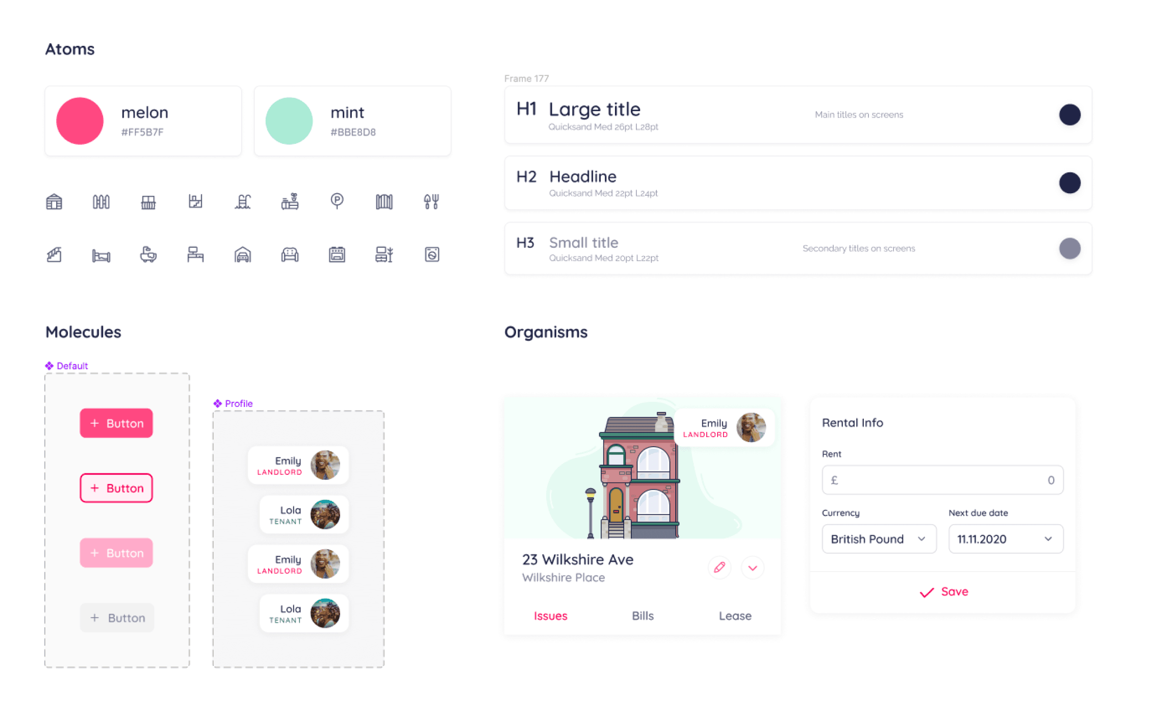
Since Juggle was in its infancy, it didn't make sense to have overly complex components, with equally expansive nested variable options. We were still testing, learning and reworking the product on the fly, so we needed to be able to swap out larger "chunks" of design in our working files, rather than having to reconfigure them in a bunch of places across the product.
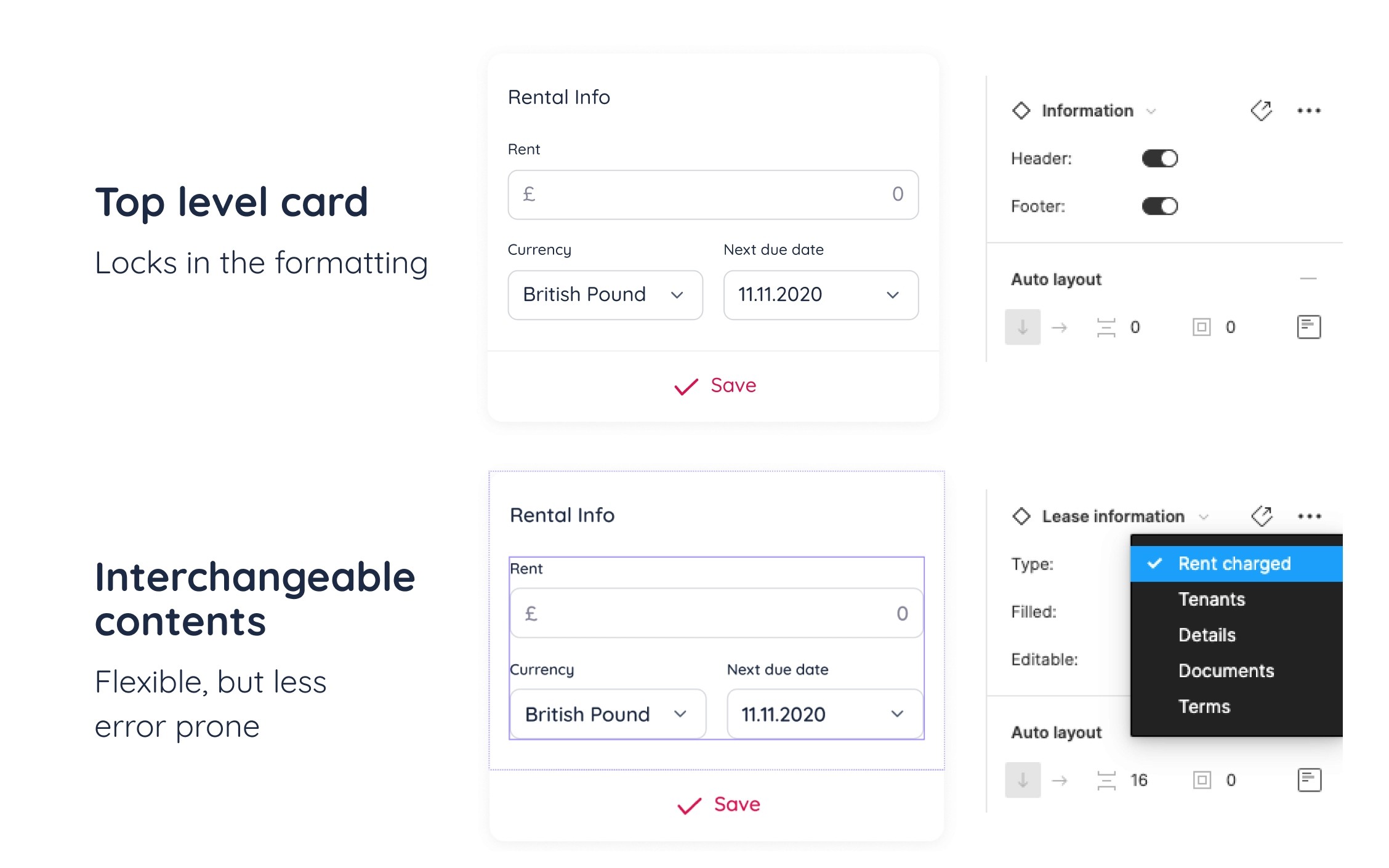
In general, overly flexible components are more error prone, less self explanatory, and a nightmare to maintain. Especially in a young design system.
With Juggle’s UI is being very card-based, it was more effective to lock in the formatting at the card level, and make blocks of content as interchangeable slots. It meant that when a layout wasn't working, we could adjust the slot component contents only without disturbing or recreating the top level formatting of the card itself - and roll it out across all working files.
The content types are exposed in the instance panel for easy discoverability. It’s easy to see which content options are available.
System file structure
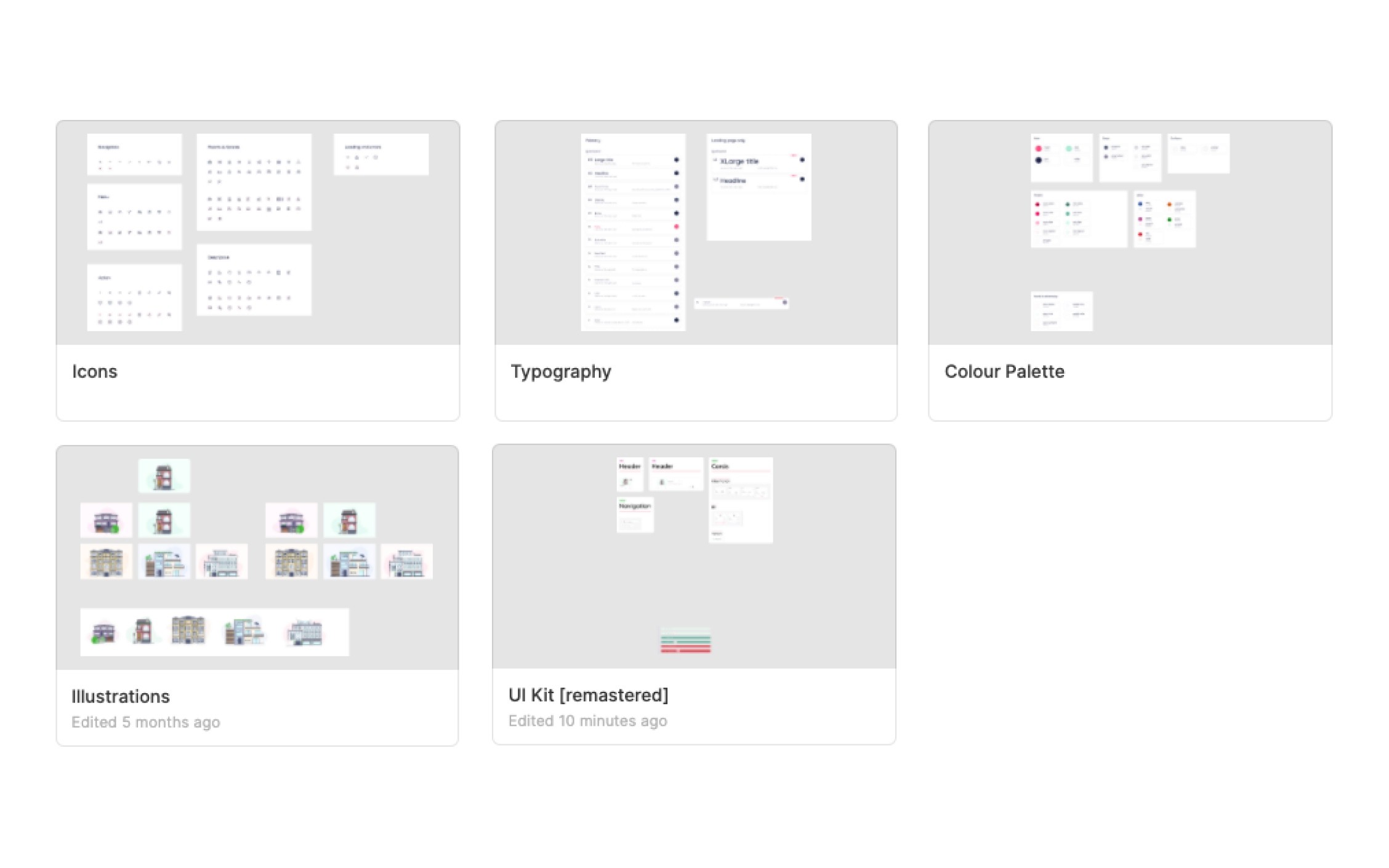
The system was structured with separate foundation files for Typography, Colour Palette, Iconography, Illustrations, and a separate UI Kit file with all components and documentation.
This structure kept the UI Kit uncluttered, with no local styles to maintain in other files. It would also have been easier to split off into platform-specific UI kits if needed, because the foundational files would remain undisturbed.


